
User Experience Design
Vaccine Provider Order Portal (VPOP) Project
My Role in This Project
VPOP Dashboard
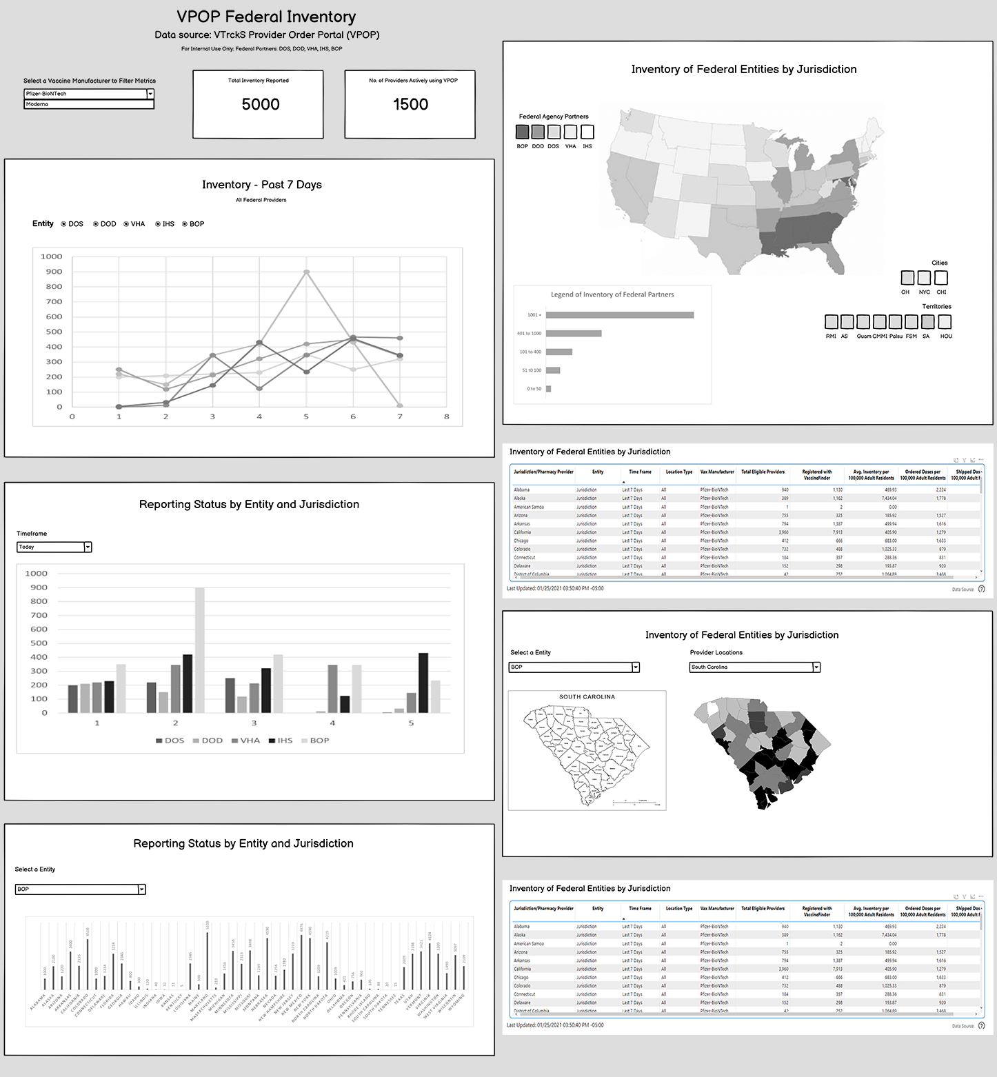
The Vaccine Provider Order Portal (VPOP) dashboard explores how vaccine inventory and reporting data could be visualized across federal jurisdictions and participating providers. The goal of this design was to structure complex datasets into a dashboard layout that allowed stakeholders to quickly interpret distribution trends and operational activity.
These low-fidelity wireframes were developed in Balsamiq to explore dashboard layout concepts, information hierarchy, and how multiple reporting datasets could be organized into a unified reporting interface.
User Research
Supported research efforts by exploring existing data sources, reporting websites, and datasets used during the pandemic response. This included identifying potential data inputs and assisting in evaluating how current and planned reporting systems could be integrated into a single dashboard environment.
UX Design
Designed dashboard wireframes that organized vaccine distribution metrics, geographic reporting data, and provider participation trends into a clear visual hierarchy. The layout prioritized critical metrics while supporting deeper analysis of reporting activity across federal jurisdictions.
Note: All data shown within this project is sample data used for demonstration purposes and does not represent actual CDC reporting information.
Dashboard Design Breakdown
The VPOP dashboard was designed to help stakeholders quickly interpret vaccine distribution activity across providers and jurisdictions. The layout prioritizes key metrics while allowing users to explore reporting trends, geographic distribution, and provider participation.
Inventory Reporting
The dashboard highlights vaccine inventory activity through trend lines and reporting summaries. These visualizations allow analysts to monitor changes in distribution activity and identify unusual reporting patterns across providers.
Geographic Distribution
A geographic map visualization allows stakeholders to explore vaccine distribution across federal jurisdictions. This view helps identify regional differences in provider participation and inventory activity.
Provider Reporting Metrics
Tabular and chart-based reporting views provide deeper insight into provider activity, reporting status, and vaccination data across multiple datasets. These elements support detailed analysis beyond the high-level dashboard overview.