
User Experience Design
Vaxview Dashboard
MY ROLE IN THE PROJECT
I completed low fidelity wireframes for the Vaxview dashboard that track coverage vaccination coverage of the following groups of people: Healthcare Workers, Pregnant Women, and Nursing Home Patients.
To complete the following dashboards I conducted are series of tasks.
- Exploring existing data sources, websites, and datasets.
- Comparing data with other pandemic flu data by states and other lower levels
- Developing datasets and other possible solutions with existing new sources
- Coordinating, integrating, and leveraging current and planned data efforts
- Defining current datasets with future datasets
Design Approach
The VaxView dashboards were designed to help public health analysts quickly interpret vaccination coverage trends across priority populations. By combining trend analysis, geographic mapping, and detailed data tables, the interface supports both high-level monitoring and deeper investigation of vaccination patterns.
Healthcare Worker Coverage Dashboard
This dashboard concept explored vaccination coverage trends among healthcare workers across reporting periods. The design focused on helping analysts quickly identify changes in coverage over time, compare trends across jurisdictions, and investigate reporting activity through multiple visualization formats.
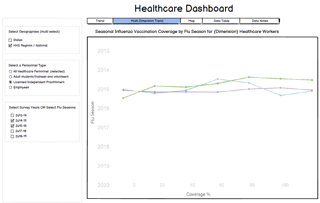
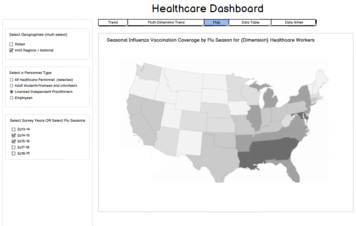
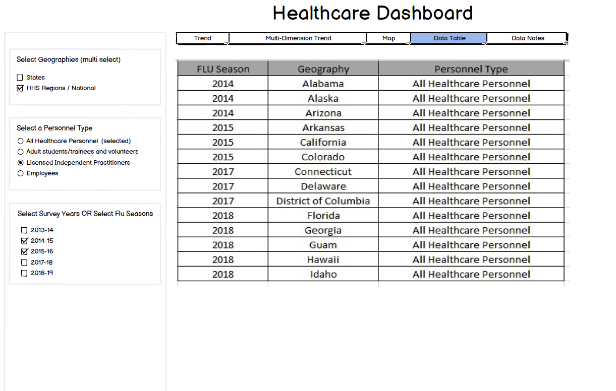
This dashboard examines vaccination coverage trends among healthcare workers across reporting periods. The visualizations allow analysts to track changes in coverage over time, compare reporting across jurisdictions, and identify patterns in vaccination uptake among frontline healthcare personnel.
Interactive Vaccination Data Dashboard
This interactive dashboard demonstrates how vaccination data can be explored through geographic mapping, comparative charts, and trend analysis. Users can interact with the visualization to examine vaccination totals by state and monitor vaccination trends over time.
Note: Data displayed in this dashboard is sample data used for demonstration purposes.
Pregnant Women Coverage Dashboard
This dashboard explores vaccination coverage trends among pregnant women during the pandemic response. The design enables analysts to examine reporting patterns across time and compare coverage trends across jurisdictions to better understand how vaccination uptake changed during different reporting periods
This dashboard analyzes vaccination coverage trends among pregnant women, enabling public health teams to monitor reporting patterns and identify changes in vaccination uptake during the pandemic. The visualizations support comparison across reporting periods and geographic regions to better understand coverage trends within this priority population.
Nursing Home Resident Coverage Dashboard
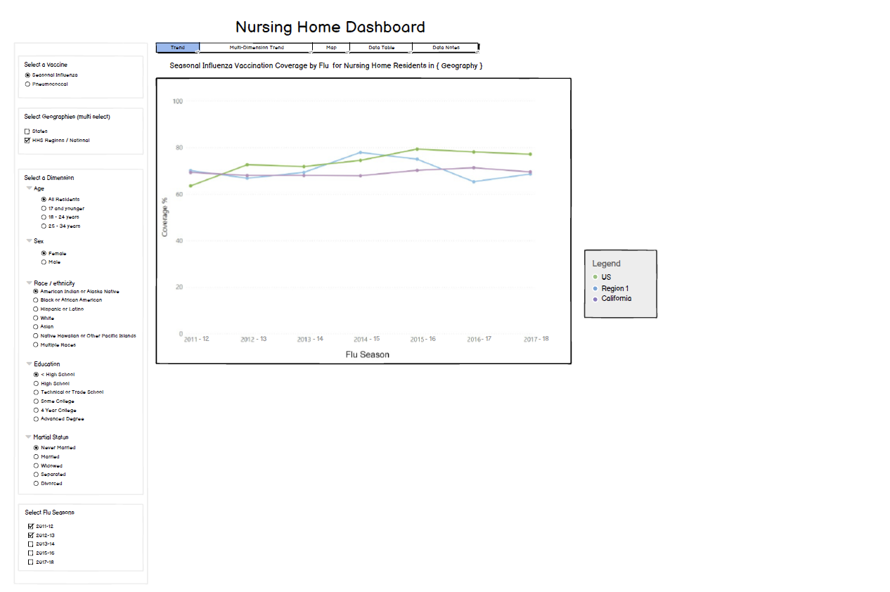
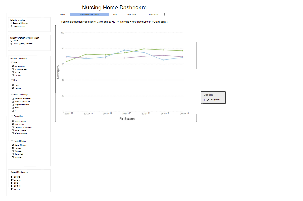
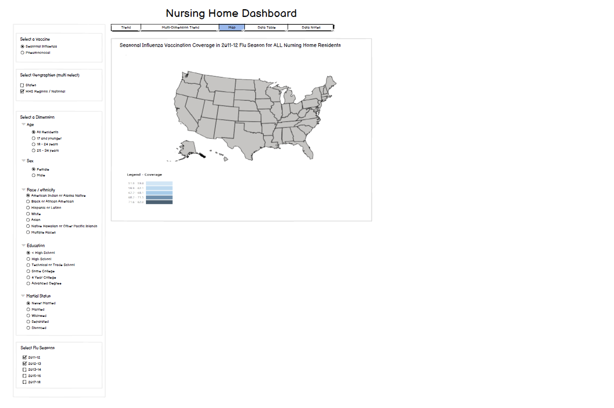
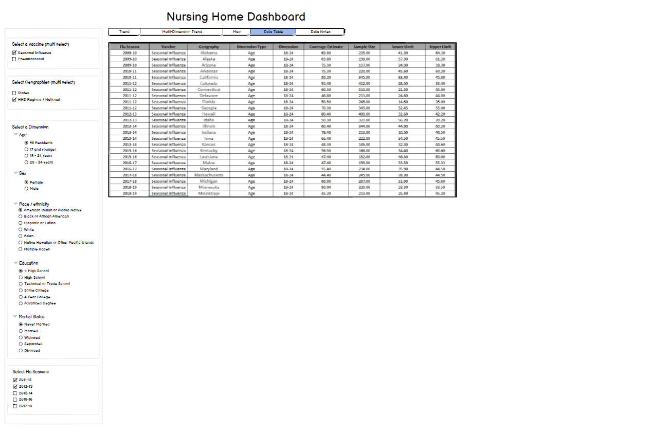
This dashboard focuses on vaccination coverage trends among nursing home residents, a population particularly vulnerable during the pandemic. The design supports monitoring coverage patterns over time and identifying geographic variations in reporting across jurisdictions.
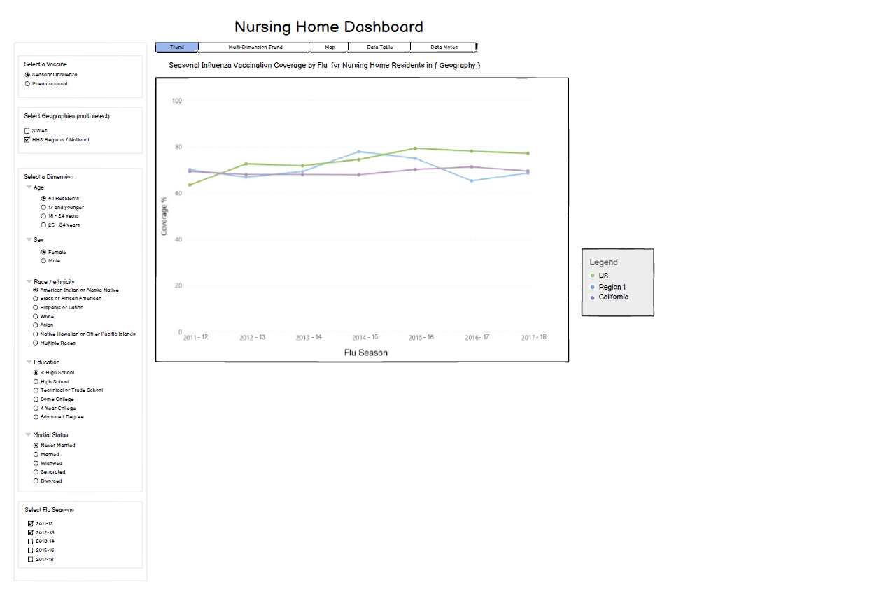
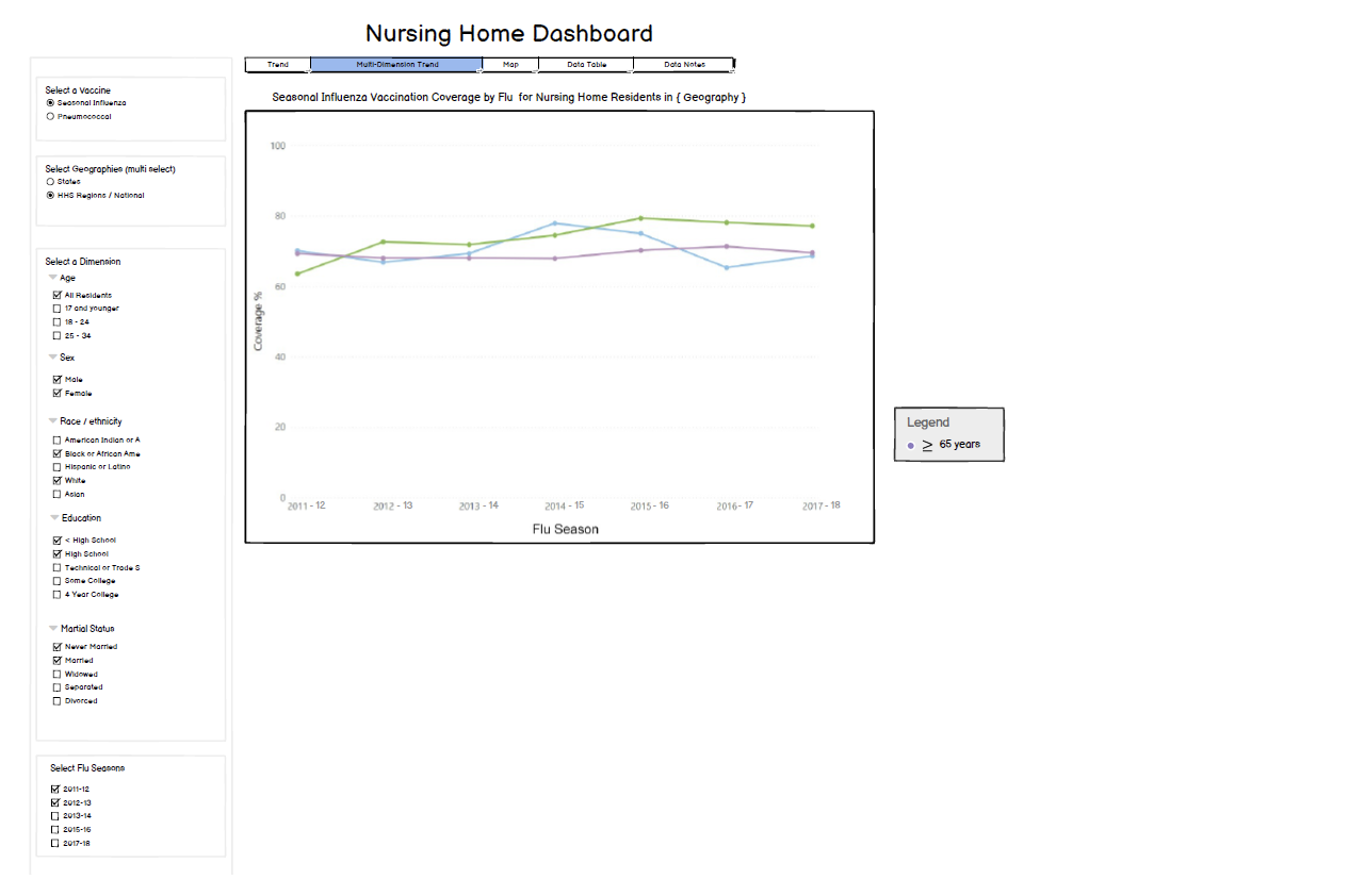
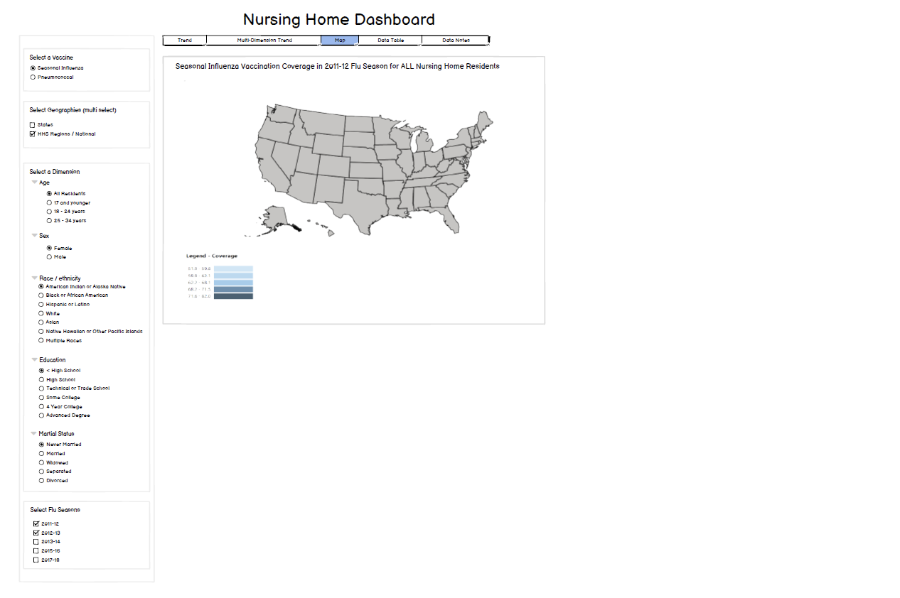
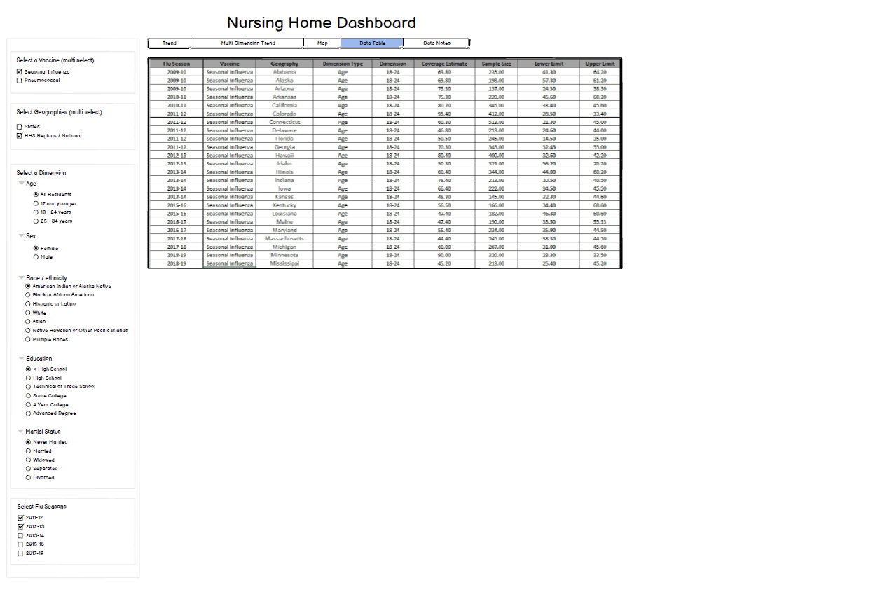
This dashboard focuses on vaccination coverage trends among nursing home residents, a population particularly vulnerable during the pandemic. The visualizations support monitoring of coverage patterns across jurisdictions and help identify variations in reporting among long-term care facilities.
How the dashboard design supported public health monitoring and data-driven decision making.
Impact
The VaxView dashboard wireframes supported the development of interactive data visualizations used to monitor vaccination coverage across priority populations. By organizing complex datasets into clear visual patterns, the design helped analysts quickly identify trends, geographic differences, and reporting insights needed for public health monitoring.