
Data Visualization & Dashboard Design
Transforming complex datasets into clear, actionable insights.
I design data dashboards that help organizations understand complex information quickly and make informed decisions. My experience includes working with federal agencies and public health teams to translate large datasets into meaningful visual insights.
View CDC Dashboard ProjectWhy Data Visualization Matters
Making Data Understandable
Organizations collect enormous amounts of data, but raw numbers alone rarely create insight. Data visualization transforms complex datasets into clear visual patterns that help stakeholders quickly recognize trends, risks, and opportunities.
When dashboards are designed with user experience in mind, decision makers can interpret information faster and act with greater confidence.
- Identify trends over time
- Compare performance across regions
- Detect gaps in service or coverage
- Support data-driven decision making
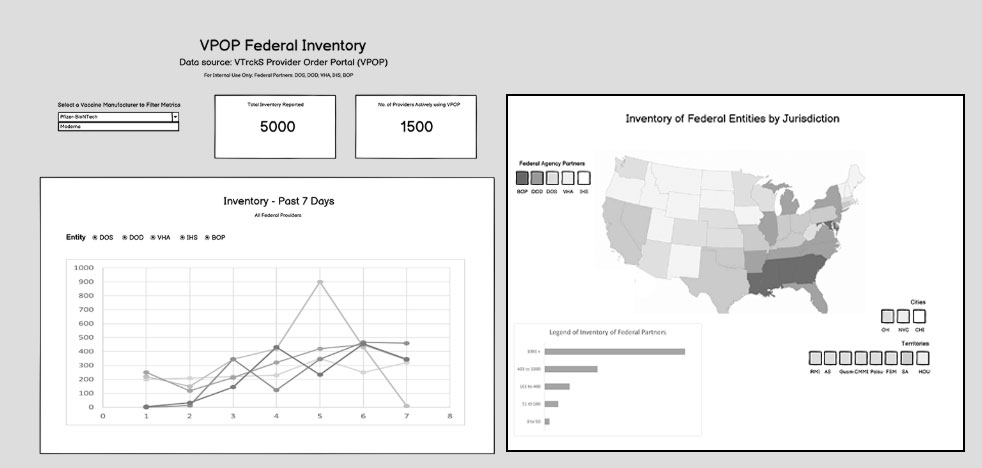
Early dashboard wireframe exploring vaccine inventory reporting trends and geographic distribution across federal jurisdictions.
My Data Visualization Process
Designing effective dashboards requires more than creating charts. It involves understanding stakeholder needs, exploring data sources, structuring information clearly, and building visualizations that support informed decision making.
Stakeholder Discovery
Collaborated with CDC stakeholders, analysts, and subject matter experts to understand reporting needs, decision points, and key questions the dashboards needed to answer.
Data Exploration
Explored available datasets and reporting structures to identify meaningful metrics and determine how information should be organized for visualization.
UX Dashboard Design
Designed low fidelity wireframes that structured complex datasets into clear visual layouts focused on usability, hierarchy, and quick interpretation.
Power BI & Tableau
Collaborated with development teams to translate dashboard concepts into interactive visualizations built using Power BI and Tableau.
Federal Vaccine Data Visualization Projects
During the COVID-19 pandemic, federal agencies required clear data reporting tools to monitor vaccine distribution and vaccination coverage across multiple populations. I contributed to the design of early dashboard wireframes that explored how complex datasets could be visualized for decision makers.
The following case studies highlight two related projects that supported data exploration and reporting for federal partners. Each project demonstrates how UX design and data visualization principles were applied to transform complex health data into meaningful insights.
VaxView Dashboard
A set of exploratory dashboards designed to visualize vaccination coverage trends across key populations including healthcare workers, pregnant women, and nursing home residents.
View Case StudyVaccine Provider Order Portal (VPOP)
Low-fidelity dashboard wireframes designed to explore vaccine distribution and reporting metrics across providers and federal jurisdictions.
View Case StudyASPR Ready Redesign Project
UX redesign concepts exploring improvements to the ASPR Ready platform used for disaster preparedness coordination and federal response operations.
View Case Study